Sunday, December 14, 2014

Free Spirit Spheres Hotel

On Vancouver Island, in Qualicum Bay there is a fairly new hotel called Free Spirit Spheres. It is a unique hoteling experience as your room is in a 9’ diameter sphere. They are also suspended 15’ in the trees.


Surrounded by a private forest on the edge of a pond, there are three spheres to choose from, each suspended independently with a staircase leading up to the entry. 

Inside, the sphere has been designed with the concept of “oneness” using Sitka spruce and yellow cedar bent into the spherical shape. The creator had the idea of making a living space suspended within the trees, both to limit the footprint and to connect the user to nature, while also utilizing bio-mimicry to fit the sphere living into the natural environment without altering it. The circular shape inspires a harmonious feeling, symbolizes our connection to nature, and creates a continuous space within that speaks to the concept of “oneness”. 


The construct uses sailboat construction and rigging practice with three separate ropes to three separate trees to distribute the load, and that allows the sphere to gently sway with the wind and the movement of your stay. Everything you need is within, (minus the composting toilet not too far away) including built in cabinets, electricity, and speakers throughout.

Sunday, November 23, 2014

NewspaperWood

NewspaperWood
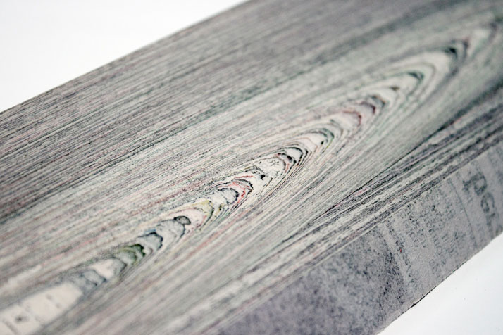
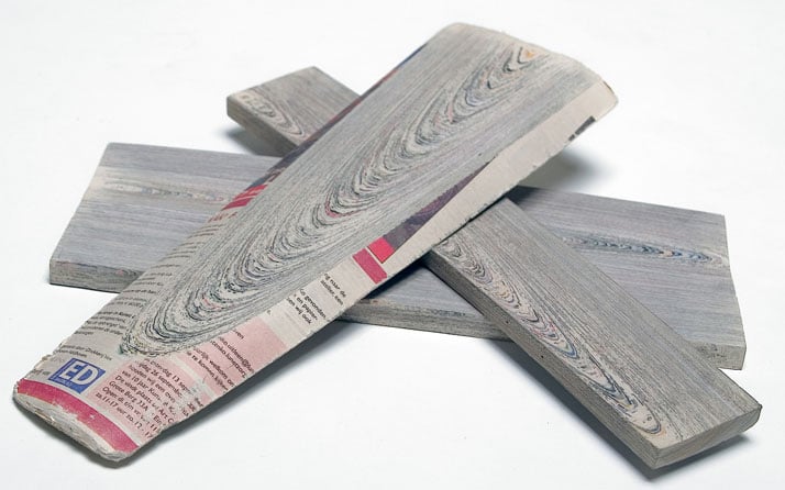
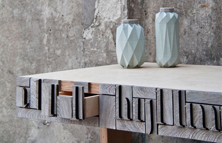
Design Academy Eindhoven graduate Mieke Meijer has created a new wood-like material by layering discarded materials, bonding them with resin and milling the material into planks, giving new life to recyclable waste.Recycling is great but why not upcycle if possible? The life cycle of newspaper is often short lived and once the article is read, the whole newsprint is sent to be recycled consuming even more resources and energy.


Mieke Meijer  decided to take the idea of wood being the "source" and paper the "result" and reverse it…making paper the "source" and wood the "result".  Buy gluing together one newsprint page to another, layer by layer he created what is today NewspaperWood.  The final result produces a paper like-appearance mimicking the grains and rings expected to see in a piece of wood.  This revolutionary product can be applied as an interior finish to millwork, and accent pieces as it is durable and gives the appearance of wood for much less!  


Website:
http://www.yatzer.com/new-material-NewspaperWood-Mieke-Meijer-Vij5


Kathie-Lee Pugsley

Saturday, November 15, 2014

The Land of Giants Power Poles- Taylor Culler

Today, high voltage power poles are scattered across the land, and we are used to them, however, one team of innovative architects proposed a new idea for what could be.  The goal for this competition was to,"obtain new ideas in types and appearances for 220kV high-voltage towers and lines. The competition emphasized that specific consideration be given to the visual impact of the towers (or lines) and that careful consideration be given to the appearance of towers near urban areas and unsettled regions." (Choi + Shine, 2010)

The client was Landscape, which is a public electrical transmission company which transfers 80% green energy across the nation. 

The design is called the Land of Giants because the power poles are large scale human sculptures that create a sense of whimsy across the Icelandic landscape. 

The design really only made minor changes to the way existing power pylons are created.  The pylons are made of steel, concrete and glass.  The innovation comes from not only the form, but the construction method as well.  Each pylon is made as a "kit of parts" making the construction cost minimal.  This increases the durability, affordability and constructability of these innovative pylons.  The materials used also are made of recycled materials making the project more sustainable.  

Whimsy is created with these pylons as each pylon has a unique gesture which would respond to the geography.  For example, as the pylon ascends a mountain, the gesture would be that of climbing.  


Tuesday, November 11, 2014

Psychedelic Lights Illuminate the Floor of a 13th-Century Castle Courtyard

French artist Miguel Chevalier can transform interior spaces like churches and castles into a kaleidoscope of colors. Magic Carpets 2014 is a recent installation that comes alive at night across the octagonal inner courtyard at the Castel del Monte, a 13th-century architectural beauty located in southeast Italy.
Inspired by the eight-sided structure, Chevalier developed a pattern of psychedelic, interactive lights that respond to the movements of visitors. Shapes and patterns swirl across the floor and, from overhead, the experience looks like a trippy blob of colors that morph together in unexpected formations, set to music by Jacopo Baboni Schilingi. "A pixelated or organic world, just like the symbolism of the octagonal form present here, the transition from the (square) earth to the (circular) sky is represented through Magic Carpets," describes the artist. "This artificial universe seems to rejoin that of life. Everything comes together, comes apart, and alters shape at top speed."
See Miguel's website for more installations like this and videos : http://www.miguel-chevalier.com/fr/index.html By Yvonne Littlewood

Sunday, November 9, 2014

A Space For Calm - Sean Lusk

Cumulus installation by Burg Giebichenstein University of Art and Design graduates
Cumulus installation by Burg Giebichenstein University of Art and Design graduatesCumulus installation by Burg Giebichenstein University of Art and Design graduates
The "Cumulus; A space for Calm"
Sean Lusk

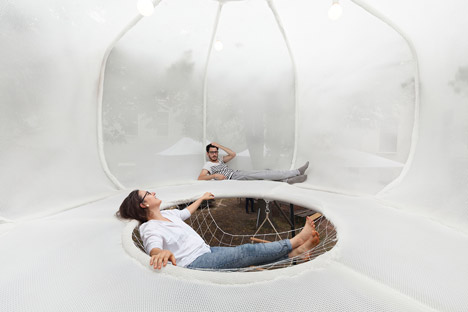
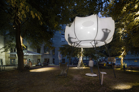
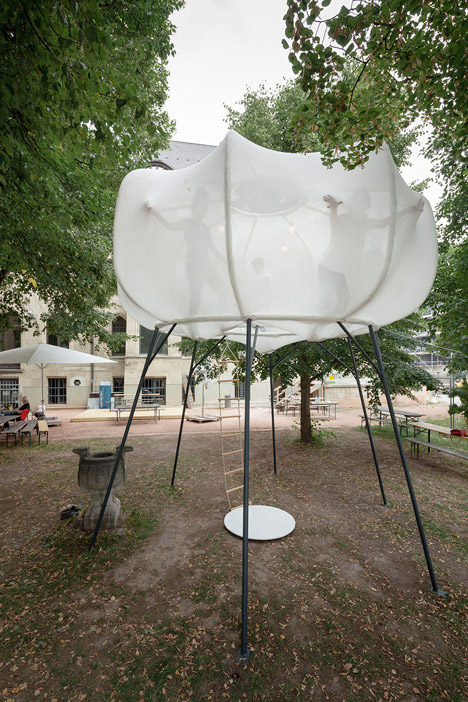
 The "Cumulus; A space for Calm" was designed by Jordi Iranzo, Stefanie Rittler and Nadine Kesting, graduates of Germany's Burg Giebichenstein University of Art and Design. The space was created in order to make users feel like they were floating in a suspended cloud. The construction of the suspended form was designed with the intent of easy assembly and dis-assembly with the students opting for a locking tubular steel work base. The fabric chosen is a permeable white elastic spacer fabric that allows for breathability and the integration of the elements. The designers wanted the structure to adapt to the weather conditions rather than block them out, the permeable fabric allows for the penetration of wind and water. The structure was installed on the University Campus after it was built with intentions to install it globally in the future. The structure is accessed through via a rope ladder that is partially covered in a netting that allows users to rest within it like a hammock. The cloud is outfitted with soft glow lighting orbs and at night emits a subtle luminescence that highlights the shadows and forms created by those inside. The small top opening in the center exposes the interior views to a small portion of sky rather than surroundings to create the feeling of weightlessly floating through the air in a soft cloud. The structure allows for a moment of pause and calm within the hectic University environment going on around it. The space created is both playful and calming, with a simplicity of form and materials used.

Saturday, November 8, 2014

London's Sugarhouse Studios Encourages Community Interaction.                               By Judith Babcock, IDSN 4720


Located on Stratford High Street in a partially abandoned industrial neighbourhood not far from the site of the 2012 London Olympics, Sugarhouse Studios is a mix-used collective that is the workshop and workspace of the company that conceived the idea - London`s ASSEMBLE and many of their collaborators.

The former industrial area is slated for redevelopment.


Since its opening in the spring of 2012, the space has hosted a season of arts cinema, construction workshops for local school children, exhibitions and late night events, and was also home to a cafe and pizzeria that first summer.   

A design and architecture collective, ASSEMBLE converted the abandoned sign-writers workshop into a space that encourages community engagement and provides a human factor element to the redevelopment of the industrial land. 


Sign boards salvaged from the building were repainted to make cafe menu boards.


With aid from the London Legacy Development Corporation, recycled and reclaimed materials were used to create a vibrant community hub where people can gather to share ideas, learn and create. 


Flipdown cinema seats are made from old scaffolding boards.


ASSEMBLE`s working practice is centred around what they feel is the importance of addressing typical disconnections between public wants and needs and the political process through which many spaces are decided. Seeking to actively involve the public as both `participant and accomplice`, the collective champions the concept of interdependence and collaboration, actively engaging their spaces with the ongoing development in areas that are being revitalized. 


Furniture from reclaimed wood populates the bar and cafe areas.


The retro-fit exploits the assets of the original shed-style building, using a light touch that respects the history of the structure. It was also relatively inexpensive due to the re-use of materials and flexibility in design that allows for ease of multi-use applications.  

95% of unreusable waste is recycled.


Originally slated for demolition in 2013 to make way for a large residential and business development, the collective has completed an expansion of additional studio space this year, further reinforcing its role as a vibrant community hub actively engaged in the area`s ongoing development.


Sources:


Friday, October 31, 2014

+ POOL - The World's First Water-Filtering, Floating Pool in New York - Ryan Barker

Concept Proposal For + Pool at Night
Vancouver, like New York, is a city surrounded by water that is questionable for some to swim in.
A small team of designers including members from Family architecture and Playlab (an innovation school) began by asking "Wouldn't it be great if we could swim in the Hudson River?" Historically there have been a number of floating pools in New York, but in 2007 a converted barge in the Bronx heralded back this concept.

The + Pool design team, headed by Dong-Ping Wong, Archie Lee Coates IV, and Jeffrey Franklin considered the fact that swimming pools are often used by everyone. The form is derivative of what the project means. In a statement from the design team, "An offshore reflection of the city intersection, + Pool both exemplifies the dense, busy character of New York City and offers an island retreat from it." The design of the plus sign is not only symbolic but also four pools in one:  


The + Pool consists of a children's pool, a sports pool, lap pool, and a lounge pool.The intention is that each can be used individually or in tandem with each other as one large 9000 sq foot party pool.   

How it Works
Deep Fried Swimmers!
Like a giant Britta Filter or Strainer, the exterior of the pool is composed of three layers of filtration to ensure that even bacteria and viruses will be kept out. It is projected to filter 500000 gallons of river water a day. The design team has worked in partnerships with the city, urban planners, engineers, organizers, developers, and environmental experts throughout the process of shaping this project. The Metropolitan Waterfront Association, NYC Swim, and the department of Parks and Recreation have also all ensured the water will be meeting health and safety standards.

Family Architecture and Playlab have already designed and tested "Float Lab" as a prototype to ensure that +Pool will function properly. Funding for "Float Lab" ($275000) has been accomplished through Kickstarter.
Float Lab Construction
The + Pool is still a Kickstarter project and will require a total of $21 million for completion. They currently require an additional 4500 additional supporters to reach their goal. When you provide support, you are given a commemorative tile with your name etched upon it as a permanent component of the construction. 
Example of Pool Tiles
The Project stands as a testament to the direction of public architecture in that it combines a publicly funded project to create a place as a reward for the many residents of a city who wish to enjoy their home. The + Pool will stand as an iconic piece of architecture and a destination for the purpose of enriching the lives of everyone. It also carries with it implications of other permanent social spaces that encourage community involvement. Further, it may add a component of a haven or park space that may spring up around it depending on its location on the Hudson.


Recently Kanye West and Olympian Conner Dwye hosted an event to raise awareness for the + Pool. This is currently the largest publicly funded civic architecture project in history and the first filtration pool to be built, The project is currently projected for a 2017 completion date. Looks like in the meantime we'll just have to do like this guy:
Cosmo Kramer - Hudson River Swimming Enthusiast

http://www.pluspool.org/